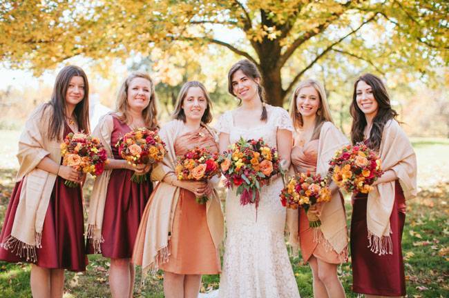
One of the reasons I love analogous colors and feel they work so well in event design is because they are often found in nature and create a serene and harmonious feel. They’re pleasing to the eye. If you’re wondering what on earth I’m talking about, Analogous colors are groups of three colors that are next to each other on the color wheel (see below). Like blue, blue-green, and green, or red, red-orange, and red-violet for example. Choosing analogous colors will give your wedding a more natural look and can help with the flow of your event’s overall style.
One of my favorite examples can be seen all over New England in the fall! Orange, red and yellow!
It is important to have enough contrast when choosing an analogous color scheme. Choose one color to lead, a second to support. The third can be used (along with black, white or gray neutrals) as an accent. Here are a few examples.
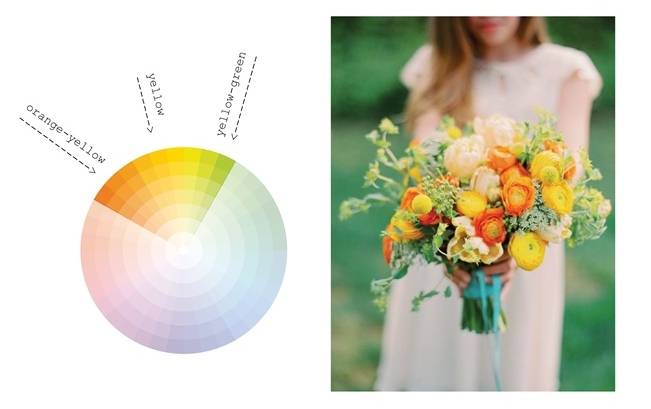
Orange-Yellow / Yellow / Yellow-Green (An equally appealing palette in spring and fall):
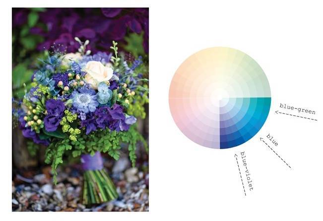
Blue-Green / Blue / Blue-Violet (Beautiful any season!):
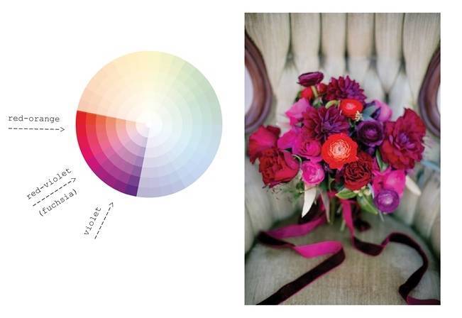
Red-Orange / Red-Violet / Violet (I love this palette for fall, summer, and even winter):
I hope you enjoyed this post and got some ideas for your pretty wedding palette! Did you have an analogous wedding palette? I’d love to hear what your colors were in the comments below. xo – Naomi


